ArrayPipe Online Documentation
[← previous] [up ↑] [next →]
Spreadsheet colouring
When you select to see your ArrayPipe results through the integrated web-based spreadsheet, you will now get the cells in the fold-change (or ratio) columns coloured according to their expression values:
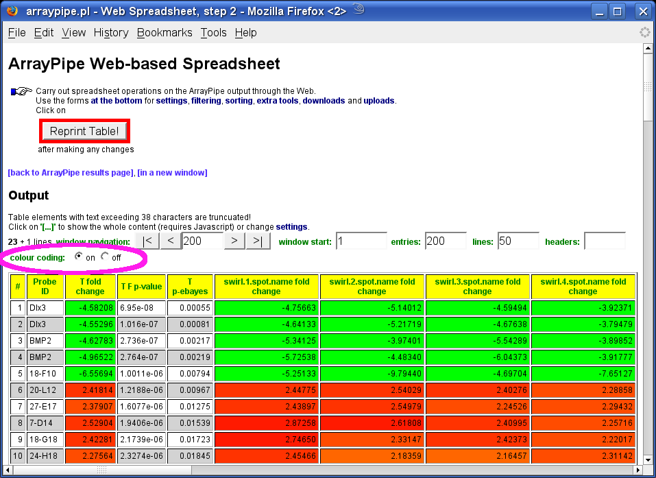
The colouring is activated by default but can be turned off by switching the radio button (see pink circle above) and clicking the 'Reprint Table!' button.
Go to the 'settings' section to control how the colors are selected and applied:
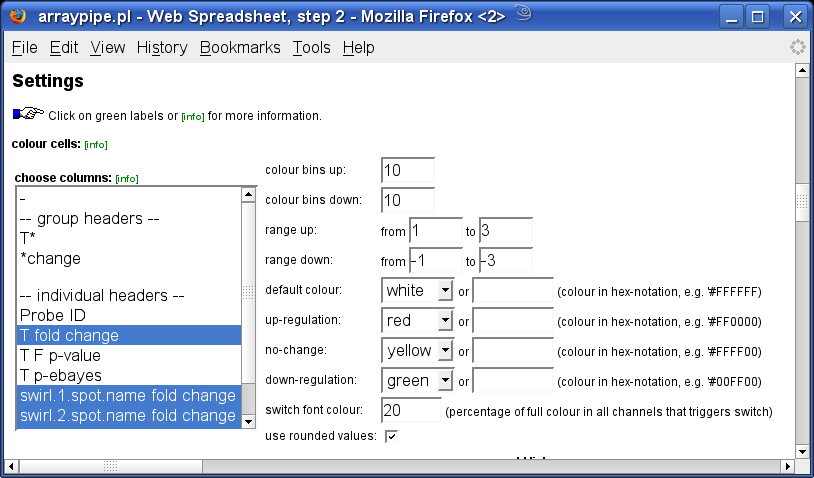
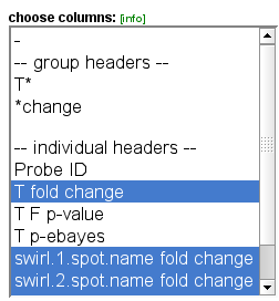
Pick multiple files using grouped headers or select individual files (hold-down ctrl and/or shift key for multiple selections) from the columns menu:
Due to the nature of up- and down-regulation in microarray studies, two colour ranges are applied.
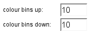
Set the number of bins into which the grades are separated:
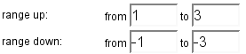
Specify the start and end values covered by the colour gradient, whereas the
starting point (from) is always closest to the middle point at or around which
the two ranges converge.
Below is an example suitable for fold-changes:

and one suitable for ratios:
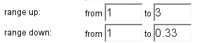

(the upper limit should be adjusted to the individual data sets)
You can choose which colours to use for the gradients, either from a pull-down menue or via hex-notation (the latter takes precedence):
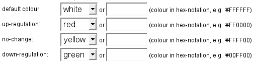
Using blue for up-regulation, yellow for down-regulation and white for no change would result in the following gradients:

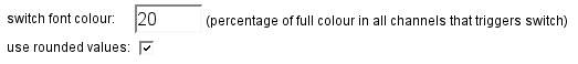
Lastly, you can specify when the font in the coloured cells switches from dark to bright and if to use rounded values (as specified in the spreadsheet) for the colour assignment:
With appropriate settings for colouring, filtering and sorting the resulting coloured spreadsheet can resemble the
popular heatmap graphs.
[← previous]
[up ↑]
[next →]
Home
for questions or remarks e-mail karsten_hokamp@sfu.ca.